ux

You are currently browsing articles tagged ux.

In Defense of D

DTDT means lots of things

A long time ago, in certain communities of practice in the “user experience” family of practices, an acronym was coined: “DTDT” aka “Defining the Damned Thing”.

For good or ill, it’s been used for years now like a flag on the play in a football game. A discussion gets underway, whether heated or not, and suddenly someone says “hey can we stop defining the damned thing? I have work to do here, and you’re cluttering my [inbox / Twitter feed / ear drums / whatever …]”

Sometimes it rightly has reset a conversation that has gone well off the rails, and that’s fine. But more often, I’ve seen it used to shut down conversations that are actually very healthy, thriving and … necessary.

Why necessary? Because conversation *about* the practice is a healthy, necessary part of being a practitioner, and being in a community of other practitioners. It’s part of maturing a practice into a discipline, and getting beyond merely doing work, and on to being self-aware about how and why you do it.

It used to be that people weren’t supposed to talk about sex either. That tended to result in lots of unhappy, closeted people in unfulfilling relationships and unfulfilled desires. Eventually we learned that talking about sex made sex better. Any healthy 21st century couple needs to have these conversations — what’s sex for? how do you see sex and how is that different from how I see it? Stuff like that. Why do people tend to avoid it? Because it makes them uncomfortable … but discomfort is no reason to shun a healthy conversation.

The same goes for design or any other practice; more often than not, what people in these conversations are trying to do is develop a shared understanding of their practice, developing their professional identities, and challenging each other to see different points of view — some of which may seem mutually exclusive, but turn out to be mutually beneficial, or even interdependent.

I’ll grant that these discussions often have more noise than signal, but that’s the price you pay to get the signal. I’ll also grant that actually “defining” a practice is largely a red herring — a thriving practice continues to evolve and discover new things about itself. Even if a conversation starts out about clean, clinical definition, it doesn’t take long before lots of other more useful (but muddier, messier) stuff is getting sorted out.

It’s ironic to me that so many people in the “UX family” of practitioner communities utterly lionize “Great Figures” of design who are largely known for what they *wrote* and *said* about design as much as for the things they made, and then turn to their peers and demand they stop talking about what their practice means, and just post more pat advice, templates or tutorials.

A while back I was doing a presentation on what neuroscience is teaching us about being designers — how our heads work when we’re making design decisions, trying to be creative, and the rest. And one of the things I learned was the importance of metacognition — the ability to think about thinking. I know people who refuse to do such a thing — they just want to jump in and ACT. But more often than not, they don’t grow, they don’t learn. They just keep doing what they’re used to, usually to the detriment of themselves and the people around them. Do you want to be one of those people? Probably not.

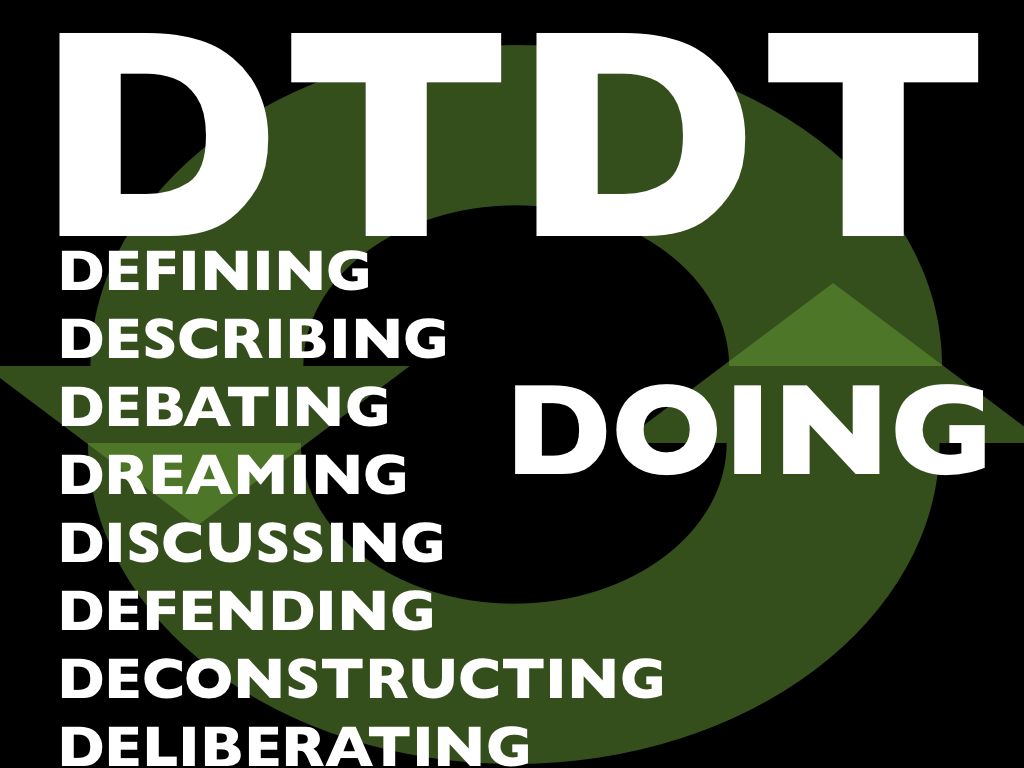
So, enough already. It’s time we defend the D. Next time you hear someone pipe up and say “hey [eyeroll] can we stop the DTDT already?” kindly remind them that mature communities of practice discuss, dream, debate, deliberate, deconstruct and the rest … because ultimately it helps us get better, deeper and stronger at the Doing.


To celebrate the recent publication of Resmini & Rosati’s “Pervasive Information Architecture,” I’m reprinting, here, my contribution to the book. Thank you, Andrea & Luca, for asking me to add my own small part to the work!

It’s strange how, over time, some things that were once rare and wondrous can become commonplace and practically unnoticed, even though they have as much or more power as they ever had. Consider things like these: fire; the lever; the wheel; antibiotics; irrigation; agriculture; the semiconductor; the book. Ironically, it’s their inestimable value that causes these inventions to be absorbed into culture so thoroughly that they become part of the fabric of societies adopting them, where their power is taken for granted.

Add to that list two more items, one very old and one very new: the map and the hyperlink.

Those of us who are surrounded by inexpensive maps tend to think of them as banal, everyday objects – a commoditized utility. And the popular conception of mapmaking is that of an antiquated, tedious craft, like book binding or working a letter-press – something one would only do as a hobby, since after all, the whole globe has been mapped by satellites at this point; and we can generate all manner of maps for free from the Internet.

But the ubiquity of maps also shows us how powerful they remain. And the ease with which we can take them for granted belies the depth of skill, talent and dedicated focus it takes for maps (and even mapping software and devices) to be designed and maintained. It’s easy to scoff at cartography as a has-been discipline – until you’re trying to get somewhere, or understand a new place, and the map is poorly made.

Consider as well the hyperlink. A much younger invention than the map, the hyperlink was invented in the mid-1960s. For years it was a rare creature living only in technology labs, until around 1987 when it was moderately popularized in Apple’s HyperCard application. Even then, it was something used mainly by hobbyists and educators and a few interactive-fiction authors; a niche technology. But when Tim Berners-Lee placed that tiny creature in the world-wide substrate of the Internet, it bloomed into the most powerful cultural engine in human history. 

And yet, within only a handful of years, people began taking the hyperlink for granted, as if it had always been around. Even now, among the digital classes, mention of “the web” is often met with a sniff of derision. “Oh that old thing — that’s so 1999.” And, “the web is obsolete – what matters now are mobile devices, augmented reality, apps and touch interfaces.” 

One has to ask, however, what good would any of the apps, mobile devices and augmented reality be without digital links? 

Where these well-meaning people go wrong is to assume the hyperlink is just a homely little clickable bit of text in a browser. The browser is an effective medium for hyperlinked experience, but it’s only one of many. The hyperlink is more than just a clicked bit of text in a browser window — it’s a core element for the digital dimension; it’s the mechanism that empowers regular people to point across time and space and suddenly be in a new place, and to create links that point the way for others as well. 

Once people have this ability, they absorb it into their lives. They assume it will be available to them like roads, or language, or air. They become so used to having it, they forget they’re using it — even when dazzled by their shiny new mobile devices, augmented reality software and touch-screen interfaces. They forget that the central, driving force that makes those technologies most meaningful is how they enable connections — to stories, knowledge, family, friends. And those connections are all, essentially, hyperlinks: pointers to other places in cyberspace. Links between conversations and those conversing — links anybody can create for anybody to use. 

This ability is now so ubiquitous, it’s virtually invisible. The interface is visible, the device is tangible, but the links and the teeming, semantic latticeworks they create are just short of corporeal. Like gravity, we can see its physical effects, but not the force itself.  And yet these systems of links — these architectures of information — are now central to daily life. Communities rely on them to constructively channel member activity. Businesses trust systems of links to connect their customers with products and their business partners with processes. People depend on them for the most mundane tasks — like checking the weather — to the most important, such as learning about a life-changing diagnosis. 

In fact, the hyperlink and the map have a lot in common. They both describe territories and point the way through them. They both present information that enables exploration and discovery. But there is a crucial difference: maps describe a separate reality, while hyperlinks create the very territory they describe. 

Each link is a new path — and a collection of paths is a new geography. The meaningful connections we create between ourselves and the things in our lives were once merely spoken words, static text or thoughts sloshing around in our heads. Now they’re structural — instantiated as part of a digital infrastructure that’s increasingly interwoven with our physical lives. When you add an old friend on a social network, you create a link unlike any link you would have made by merely sending a letter or calling them on the phone. It’s a new path from the place that represents your friend to the place that represents you. Two islands that were once related only in stories and memories, now connected by a bridge. 

Or think of how you use a photograph. Until recently, it was something you’d either frame and display on a shelf, carry in your wallet, or keep stored in a closet. But online you can upload that photo where it has its own unique location. By creating the place, you create the ability to link to it — and the links create paths, which add to the the ever-expanding geography of cyberspace. 

Another important difference between the hyperlinks and traditional maps is that digital space allows us to create maps with conditional logic. We can create rules that cause a place to respond to, interact with, and be rearranged by its inhabitants. A blog can allow links to add comments or have them turned off; a store can allow product links to rearrange themselves on shelves in response to the shopper’s area of interest; a phone app can add a link to your physical location or not, at the flick of a settings switch. These are architectural structures for informational mediums; the machinery that enables everyday activity in the living web of the networked dimension. 

The great challenge of information architecture is to design mechanisms that have deep implications for human experience, using a raw material no one can see except in its effects. It’s to create living, jointed, functioning frameworks out of something as disembodied as language, and yet create places suitable for very real, physical purposes.  Information architecture uses maps and paths to create livable habitats in the air around us, folded into our daily lives — a new geography somehow separate, yet inseparable, from what came before. 

roadsigns

I’ve recently run across some stories involving Pixar, Apple and game design company Blizzard Entertainment that serve as great examples of courageous redirection.

What I mean by that phrase is an instance where a design team or company was courageous enough to change direction even after huge investment of time, money and vision.

Changing direction isn’t inherently beneficial, of course. And sometimes it goes awry. But these instances are pretty inspirational, because they resulted in awesomely successful user-experience products.

Work colleague Anne Gibson recently shared an article at work quoting Steve Jobs talking about Toy Story and the iPhone. While I realize we’re all getting tired of comparing ourselves to Apple and Pixar, it’s still worth a listen:

At Pixar when we were making Toy Story, there came a time when we were forced to admit that the story wasn’t great. It just wasn’t great. We stopped production for five months…. We paid them all to twiddle their thumbs while the team perfected the story into what became Toy Story. And if they hadn’t had the courage to stop, there would have never been a Toy Story the way it is, and there probably would have never been a Pixar.

(Odd how Jobs doesn’t mention John Lasseter, who I suspect was the driving force behind this particular redirection.)

Jobs goes on to explain how they never expected to run into one of those defining moments again, but that instead they tend to run into such a moment on every film at Pixar. They’ve gotten better at it, but “there always seems to come a moment where it’s just not working, and it’s so easy to fool yourself – to convince yourself that it is when you know in your heart that it isn’t.

That’s a weird, sinking feeling, but it’s hard to catch. Any designer (or writer or other craftsperson) has these moments, where you know something is wrong, but even if you can put your finger on what it is, the momentum of the group and the work already done creates a kind of inertia that pushes you into compromise.

Design is always full of compromise, of course. Real life work has constraints. But sometimes there’s a particular decision that feels ultimately defining in some way, and you have to decide if you want to take the road less traveled.

Jobs continues with a similar situation involving the now-iconic iPhone:

We had a different enclosure design for this iPhone until way too close to the introduction to ever change it. And I came in one Monday morning, I said, ‘I just don’t love this. I can’t convince myself to fall in love with this. And this is the most important product we’ve ever done.’ And we pushed the reset button.

Rather than everyone on the team whining and complaining, they volunteered to put in extra time and effort to change the design while still staying on schedule.

Of course, this is Jobs talking — he’s a master promoter. I’m sure it wasn’t as utopian as he makes out. Plus, from everything we hear, he’s not a boss you want to whine or complain to. If a mid-level manager had come in one day saying “I’m not in love with this” I have to wonder how likely this turnaround would’ve been. Still, an impressive moment.

You might think it’s necessary to have a Steve Jobs around in order to achieve such redirection. But, it’s not.

Another of the most successful products on the planet is Blizzard’s World of Warcraft — the massively multiplayer universe with over 10 million subscribers and growing. This brand has an incredibly loyal following, much of that due to the way Blizzard interacts socially with the fans of their games (including the Starcraft and Diablo franchises).

Gaming news site IGN recently ran a thorough history of Warcraft, a franchise that started about fifteen years ago with an innovative real-time-strategy computer game, “Warcraft: Orcs & Humans.”

A few years after that release, Blizzard tried developing an adventure-style game using the Warcraft concept called Warcraft Adventures. From the article:

Originally slated to release in time for the 1997 holidays, Warcraft Adventures ran late, like so many other Blizzard projects. During its development, Lucas released Curse of Monkey Island – considered by many to be the pinnacle of classic 2D adventures – and announced Grim Fandango, their ambitious first step into 3D. Blizzard’s competition had no intention of waiting up. Their confidence waned as the project neared completion …

As E3 approached, they took a hard look at their product, but their confidence had already been shattered. Curse of Monkey Island’s perfectly executed hand-drawn animation trumped Warcraft Adventures before it was even in beta, and Grim Fandango looked to make it downright obsolete. Days before the show, they made the difficult decision to can the project altogether. It wasn’t that they weren’t proud of the game the work they had done, but the moment had simply passed, and their chance to wow their fans had gone. It would have been easier and more profitable to simply finish the game up, but their commitment was just that strong. If they didn’t think it was the best, it wouldn’t see the light of day.

Sounds like a total loss, right?

But here’s what they won: Blizzard is now known for providing only the best experiences. People who know the brand do not hesitate to drop $50-60 for a new title as soon as it’s available, reviews unseen.

In addition, the story and art development for Warcraft Adventures later became raw material for World of Warcraft.

I’m aware of some other stories like this, such as how Flickr came from a redirection away from making a computer game … what are some others?

In an article called “The Neuroscience of Leadership” (free registration required*), from Strategy + Business a few years ago, the writers explain how new understanding about how the brain works helps us see why it’s so hard for us to fully comprehend new ideas. I keep cycling back to this article since I read it just a few months ago, because it helps me put a lot of things that have perpetually bedeviled me in a better perspective.

One particularly salient bit:

Attention continually reshapes the patterns of the brain. Among the implications: People who practice a specialty every day literally think differently, through different sets of connections, than do people who don’t practice the specialty. In business, professionals in different functions — finance, operations, legal, research an development, marketing, design, and human resources — have physiological differences that prevent them from seeing the world the same way.

Note the word “physiological.” We tend to assume that people’s differences of opinion or perspective are more like software — something with a switch that the person could just flip to the other side, if they simply weren’t so stubborn. The problem is, the brain grows hardware based on repeated patterns of experience. So, while stubbornness may be a factor, it’s not so simple as we might hope to get another person to understand a different perspective.

Recently I’ve had a number of conversations with colleagues about why certain industries or professions seem stuck in a particular mode, unable to see the world changing so drastically around them. For example, why don’t most advertising and marketing professionals get that a website isn’t about getting eyeballs, it’s about creating useful, usable, delightful interactive experiences? And even if they nod along with that sentiment in the beginning, they seem clueless once the work starts?

Or why do some or coworkers just not seem to get a point you’re making about a project? Why is it so hard to collaborate on strategy with an engineer or code developer? Why is it so hard for managers to get those they manage to understand the priorities of the organization?

And in these conversations, it’s tempting — and fun! — to somewhat demonize the other crowd, and get pretty negative about our complaints.

While that may feel good (and while my typing this will probably not keep me from sometimes indulging in such a bitch-and-moan session), it doesn’t help us solve the problem. Because what’s at work here is a fundamental difference in how our brains process the world around us. Doing a certain kind of work in a particular culture of others that work creates a particular architecture in our brains, and continually reinforces it. If your brain grows a hammer, everything looks like a nail; if it grows a set of jumper cables, everything looks like a car battery.

Now … add this understanding to the work Jonathan Haidt and others have done showing that we’re already predisposed toward deep assumptions about fundamental morals and values. Suddenly it’s pretty clear why some of our biggest problems in politics, religion, bigotry and the rest are so damned intractable.

But even if we’re not trying to solve world hunger and political turmoil, even if we’re just trying to get a coworker or client to understand a different way of seeing something, it’s evident that bridging the gap in understanding is not just a peripheral challenge for doing great design work — it may be the most important design problem we face.

I don’t have a ready remedy, by the way. But I do know that one way to start building bridges over these chasms of understanding is to look at ourselves, and be brutally honest about our own limitations.

I almost titled this post “Why Some People Just Don’t Get It” — but I realized that sets the wrong tone right away. “Some People” becomes an easy way to turn others into objects of ridicule, which I’ve done myself even on this blog. It’s easy, and it feels good for a while, but it doesn’t help the situation get better.

As a designer, have you imagined what it’s like to see the world from the other person’s experience? Isn’t that what we mean when we say the “experience” part of “user experience design” — that we design based on an understanding of the experience of the other? What if we treated these differences in point of view as design problems? Are we up to the challenge?

Later Edit:

There have been some excellent comments, some of which have helped me see I could’ve been more clear on a couple of points.

I perhaps overstated the “hardware” point above. I neglected to mention the importance of ‘neuroplasticity‘ — and that the very fact we inadvertently carve grooves into the silly-putty of our brains also means we can make new grooves. This is something about the brain that we’ve only come to understand in the last 20-30 years (I grew up learning the brain was frozen at adulthood). The science speaks for itself much better than I can poorly summarize it here.

The concept has become very important to me lately, in my personal life, doing some hard psychological work to undo some of the “wiring” that’s been in my way for too long.

But in our role as designers, we don’t often get to do psychotherapy with clients and coworkers. So we have to design our way to a meeting of minds — and that means 1) fully understanding where the other is coming from, and 2) being sure we challenge our own presuppositions and blind spots. This is always better than just retreating to “those people don’t get it” and checking out on the challenge altogether, which happens a lot.

Thanks for the comments!

* Yet another note: the article is excellent; a shame registration is required, but it only takes a moment, and in this case I think it’s worth the trouble.

UX Insight Elements

Funny how things can pop into your head when you’re not thinking about them. I can’t remember why this occurred to me last week … but it was one of those thoughts I realized I should write down so I could use it later. So I tweeted it. Lots of people kindly “re-tweeted” the thought, which immediately made me self-conscious that it may not explain itself very well. So now I’m blogging about it. Because that’s what we kids do nowadays.

My tweet: User Experience Design is not data-driven, it’s insight-driven. Data is just raw material for insight.

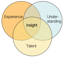
I whipped up a little model to illustrate the larger point: insight comes from a synthesis between talent, expertise, and the fresh understanding we gain through research. It’s a set of ingredients that, when added to our brains and allowed to stew, often over a meal or after a few good nights’ sleep, can bring a designer to those moments of clarity where a direction finally makes sense.

I’ve seen a lot of talk lately about how we shouldn’t be letting data drive our design decisions — that we’re designers, so we should be designing based on best practices, ideas, expertise, and even “taste.” (I have issues with the word “taste” as many people use it, but I don’t have a problem with the idea of “expert intuition” which is I think more what a lot of my colleagues mean. In fact, that Ira Glass video that made the rounds a few weeks ago on many tweets/blogs puts a better spin on the word “taste” as one’s aspiration that may be, for now, beyond one’s actual abilities, without work and practice.)

As for the word “data” — I’m referring to empirical data as well as the recorded results of something less numbers-based, like contextual research. Data is an input to our understanding, but nothing more. Data cannot tell us, directly, how to design anything.

But it’s also ludicrous to ask a client or employer to spend their money based solely on your expertise or … “taste.” Famous interior or clothing designers or architects can perhaps get away with this — because their names carry inherent value, whether their designs are actually useful or not. So far, User Experience design practitioners don’t have this (dubious) luxury. I would argue that we shouldn’t, otherwise we’re not paying much attention to “user experience” to begin with.

Data is valuable, useful, and often essential. Data can be an excellent input for design insight. I’d wager that you should have as much background data as you can get your hands on, unless you have a compelling reason to exclude it. In addition, our clients tend to speak the language of data, so we need to be able to translate our approach into that language.

It’s just that data doesn’t do the job alone. We still need to do the work of interpretation, which requires challenging our presuppositions, blind spots and various biases.

The propensity for the human brain to completely screw stuff up with cognitive bias is, alone, reason enough to put our design ideas through a bit of rigor. Reading through the oft-linked list of cognitive biases on Wikipedia is hopefully enough to caution any of us against the hubris of our own expertise. We need to do the work of seeing the design problem anew, with fresh understanding, putting our assumptions on the table and making sure they’re still viable. To me, at least, that’s a central tenet behind the cultural history of “user experience” design approaches.

But analysis paralysis can also be a serious problem; and data is only as good as its interpretation. Eventually, actual design has to happen. Otherwise you end up with a disjointed palimpsest, a Frankenstein’s Monster of point-of-pain fixes and market-tested features.

We have to be able to do both: use data to inform the fullest possible understanding of the behavior and context of potential users, as well as bring our own experience and talent to the challenge. And that’s hard to do, in the midst of managing client expectations, creating deliverables, and endless meetings and readouts. But who said it was easy?

Here’s the presentation I did for A Summit 2009 in Memphis, TN. It’s an update of what I did for IDEA 2008; it’s not hugely different, but I think it pulls the ideas together a little better. The PDF is downloadable from SlideShare. The notes are legible only at full-screen or on the PDF.

The UX Tribe

UX Meta-community of practiceI don’t have much to say about this, I just want to see if I can inject a meme in the bloodstream, so to speak.
Just an expanded thought I had recently about the nature of all the design practices in the User Experience space. From the tweets and posts and other chatter that drifted my way from the IxDA conference in Vancouver last week, I heard a few comments around whether or not Interaction Designers and Information Architects are the same, or different, or what. Not to mention Usability professionals, Researchers, Engineers, Interface Programmers, or whatever other labels are involved in the sort of work all these people do.

Here’s what I think is happening. I believe we’re all part of the same tribe, living in the same village — but we happen to gather and tell our stories around different camp-fires.

And I think that is OK. As long as we don’t mistake the campfires for separate tribes and villages.

The User Experience (UX) space is big enough, complex enough and evolving quickly enough that there are many folds, areas of focus, and centers of gravity for people’s talents and interests. We are all still sorting these things out — and will continue to do so.

Find me a single profession, no matter how old, that doesn’t have these same variations, tensions and spectrums of interest or philosophical approach. If it’s a living, thriving profession, it’ll have all these things. It’s just that some have been around long enough to have a reified image of stasis.

We need different campfires, different stories and circles of lore. It’s good and healthy. But this is a fairly recently converged family of practices that needs to understand what unifies us first, so that our conversations about what separates us can be more constructive.

The IAI is one campfire. IxDA is another. CHI yet another, and so-on. Over time, some of these may burn down to mere embers and others will turn into bonfires. That’s OK too. As long as, when it comes time to hunt antelope, we all eat the BBQ together.

And now I’m hungry for BBQ. So I’ll leave it at that.

PS: a couple of presentations where I’ve gone into some of these issues, if you haven’t seen them before: UX As Communities of Practice; Linkosophy.

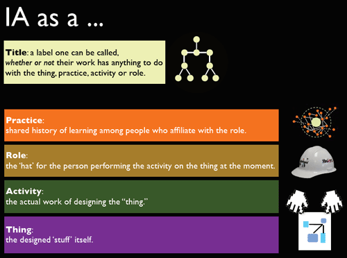
In the closing talk for this year’s IA Summit, I had a slide that explains the various layers that make up what we use the term “Information Architect” (or “Information Architecture”) to denote. I think it’s important to be self-aware about it, because it helps us avoid a lot of wasted breath and miscommunication.

But I also stressed that I don’t think this model is only true of IA. So please, feel free to replace “IA” in the diagram with the name of any practice, profession or domain of work.

To understand this diagram, especially the part about Practice, it helps to have a basic understanding of what “practice” is and how it emerges from a community that coalesces around a shared concern. The Linkosophy deck gets into that, and my UX as Communities of Practice deck does as well, while getting into more detail about the participation/reification dynamic Wenger describes in his work.

Here’s the model: I’ll do a bit of explanation after the jump.

title and role stack (small version)

Read the rest of this entry »