Articles by Andrew

Owner of inkblurt.com

UX Insight Elements

Funny how things can pop into your head when you’re not thinking about them. I can’t remember why this occurred to me last week … but it was one of those thoughts I realized I should write down so I could use it later. So I tweeted it. Lots of people kindly “re-tweeted” the thought, which immediately made me self-conscious that it may not explain itself very well. So now I’m blogging about it. Because that’s what we kids do nowadays.

My tweet: User Experience Design is not data-driven, it’s insight-driven. Data is just raw material for insight.

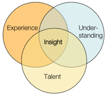
I whipped up a little model to illustrate the larger point: insight comes from a synthesis between talent, expertise, and the fresh understanding we gain through research. It’s a set of ingredients that, when added to our brains and allowed to stew, often over a meal or after a few good nights’ sleep, can bring a designer to those moments of clarity where a direction finally makes sense.

I’ve seen a lot of talk lately about how we shouldn’t be letting data drive our design decisions — that we’re designers, so we should be designing based on best practices, ideas, expertise, and even “taste.” (I have issues with the word “taste” as many people use it, but I don’t have a problem with the idea of “expert intuition” which is I think more what a lot of my colleagues mean. In fact, that Ira Glass video that made the rounds a few weeks ago on many tweets/blogs puts a better spin on the word “taste” as one’s aspiration that may be, for now, beyond one’s actual abilities, without work and practice.)

As for the word “data” — I’m referring to empirical data as well as the recorded results of something less numbers-based, like contextual research. Data is an input to our understanding, but nothing more. Data cannot tell us, directly, how to design anything.

But it’s also ludicrous to ask a client or employer to spend their money based solely on your expertise or … “taste.” Famous interior or clothing designers or architects can perhaps get away with this — because their names carry inherent value, whether their designs are actually useful or not. So far, User Experience design practitioners don’t have this (dubious) luxury. I would argue that we shouldn’t, otherwise we’re not paying much attention to “user experience” to begin with.

Data is valuable, useful, and often essential. Data can be an excellent input for design insight. I’d wager that you should have as much background data as you can get your hands on, unless you have a compelling reason to exclude it. In addition, our clients tend to speak the language of data, so we need to be able to translate our approach into that language.

It’s just that data doesn’t do the job alone. We still need to do the work of interpretation, which requires challenging our presuppositions, blind spots and various biases.

The propensity for the human brain to completely screw stuff up with cognitive bias is, alone, reason enough to put our design ideas through a bit of rigor. Reading through the oft-linked list of cognitive biases on Wikipedia is hopefully enough to caution any of us against the hubris of our own expertise. We need to do the work of seeing the design problem anew, with fresh understanding, putting our assumptions on the table and making sure they’re still viable. To me, at least, that’s a central tenet behind the cultural history of “user experience” design approaches.

But analysis paralysis can also be a serious problem; and data is only as good as its interpretation. Eventually, actual design has to happen. Otherwise you end up with a disjointed palimpsest, a Frankenstein’s Monster of point-of-pain fixes and market-tested features.

We have to be able to do both: use data to inform the fullest possible understanding of the behavior and context of potential users, as well as bring our own experience and talent to the challenge. And that’s hard to do, in the midst of managing client expectations, creating deliverables, and endless meetings and readouts. But who said it was easy?

There’s been a recent brouhaha in the political blogosphere about whether or not it’s ethical to publish under a pseudonym. And a lot of the debate seems to me to have missed an important point.

There’s a difference between random, anonymous pot-shot behavior and creating a secondary persona. It could very well be that a writer has good reason to create a second self to be the vehicle for expression. The key to this facet of identity is reputation.

In order to gain any traction in the marketplace of ideas, one must cultivate a consistent persona, over time. In effect, the writer has to create a separate identity — but it’s an identity just the same. Its reputation stands on its behavior and its words. If the author is invested at all in that identity, then its reputation is very important to the author, just like their “real” identity and reputation.

The Internet is full of examples where regular people have joined a discussion board, or started an anonymous blog or Live Journal and, before they know it, they have friendships and connections that are important to them in that parallel world of writing, sharing and discussion. Whether those people know the writer’s real name or not becomes beside the point. (Sherry Turkle and others have been exploring these ideas about identity online for many years now.)

What publishing has provided us, definitely since the printing press and especially since the Internet, is the ability to express ideas as *ideas* with very little worry about real-life baggage, anxieties, expectations and relationships getting in the way. It’s a marketplace where the ideas and their articulation can stand on their own.

Of course, history shows a long tradition of pseudonyms. Benjamin Franklin and Alexander Hamilton wrote under pseudonyms in order to make their points (Franklin as “Mrs Silence Dogood” and later — as an open secret — “Poor Richard”) and Hamilton as “Publius” (which happens to be the pseudonym adopted by the blogger at the center of the disagreement mentioned above). Other writers modified or changed their names so as to improve their chances of publication or being taken seriously. Marian Evans was able to publish brutally, psychologically frank fiction, partly because she published under the name George Eliot. And Samuel Clemens famously wrote under the name Mark Twain, as a way to reinvent his whole identity. While all of these don’t fit a precise pattern, the point is that publishing has always had generally accepted innovations involving the writer’s identity.

None of this is to say that anonymity doesn’t come with a downside. It certainly does. But lumping all anonymous or pseudonym-written writers into the same category doesn’t help.

It appears someone has posted the now-classic episode of Nightline about Ideo (called the Deep Dive) to YouTube. I hope it’s legit and Disney/ABC isn’t going to make somebody take them down. But here’s the link, hoping that doesn’t happen.

About 10 years ago, I started a job as an “Internet Copywriter” at a small web consultancy in North Carolina. By then, I’d already been steeped in the ‘net for seven or eight years, but mainly as a side-interest. My day jobs had been web-involved but not centrally, and my most meaningful learning experiences designing for the web had been side projects for fun. When I started at the new web company job, I knew there would need to be more to my role than just “concepting” and writing copy next to an art director, advertising-style. Our job was to make things people could *use* not just look at or be inspired to action by. But to be frank, I had little background in paid design work.

I’d been designing software of one kind or another off and on for a while, in part-time jobs while in graduate school. For example, creating a client database application to make my life easier in an office manager job (and then having to make it easy enough for the computer-phobic clerical staff to use as well). But I’d approached it as a tinkerer and co-user — making things I myself would be using, and iterating on them over time. (I’d taken a 3-dimensional design class in college, but it was more artistically focused — I had yet to learn much at all about industrial design, and had not yet discovered the nascent IA community, usability crowd, etc.)

Then I happened upon a Nightline broadcast (which, oddly, I never used to watch — who knows why I had it on at this point) where they engaged the design company Ideo. And I was blown away. It made perfect sense… here was a company that had codified an approach to design that I had been groping for intuitively, but not fully grasped and articulated. It put into sharp clarity a number of crucial principles such as behavioral observation and structured creative anarchy.

I immediately asked my new employer to let me order the video and share it with them. It served as a catalyst for finding out more about such approaches to design.

Since then, I’ve of course become less fully enamored of these videos… after a while you start to see the sleight-of-hand that an edited, idealized profile creates, and how it was probably the best PR event Ideo ever had. And ten years gives us the hind-sight to see that Ideo’s supposedly genius shopping cart didn’t exactly catch on — in retrospect we see that it was a fairly flawed design in many ways (in a busy grocery store, how many carts can reasonably be left at the end-caps while shoppers walk about with the hand-baskets?).

But for anyone who isn’t familiar with the essence of what many people I know call “user experience design,” this show is still an excellent teaching tool. You can see people viscerally react to it — sudden realization about how messy design is, by nature, how interdependent it is with physically experiencing your potential users, how the culture needed for creative collaboration has to be cultivated, protected from the Cartesian efficiencies and expectations of the traditional business world, and how important it is to have effective liaisons between those cultures, as well as a wise approach to structuring the necessary turbulence that creative work brings.

Then again, maybe everybody doesn’t see all that … but I’ve seen it happen.

What I find amazing, however, is this: even back then, they were saying this was the most-requested video order from ABC. This movie has been shown countless times in meetings and management retreats. And yet, the basic approach is still so rare to find. The Cartesian efficiencies and expectations form a powerful presence. What it comes down to is this: making room for this kind of work to be done well is hard work itself.

And that’s why Ideo is still in business.

Brain (from Wikipedia)

Lately, I can’t seem to get enough of learning about brain science — neurological stuff, psychological stuff, whatever. Bring it on. There’s an amazing explosion of learning going on about our brains, and our minds (and how our brains give rise to our minds, and vice-versa).

I can’t help but think this is all great news for designers of all stripes. How can it but help for us to better understand how cognition works, how we make decisions, how our identities are formed and change over time, or even what it means for us to be happy? There are a few really excellent articles I’ve run across recently (and seen lots of folks linking to from Twitter as well).

First, this beautifully written, deeply human piece in The Atlantic on “What Makes Us Happy?” It follows a unique, longitudinal study of a generation of men who were first measured and tracked at Harvard in the 30s, as mere teenagers. It’s deftly honest about the inherent limitations in such work, but shows how valuable the results have been anyway. Mainly it’s worth reading because of its poignancy and introspection.

Another article: “Don’t! The Secret of Self Control” is from Jonah Lehrer, who’s fast becoming the Carl Sagan of Neuroscience. (And I mean that in nothing but a good way.) It looks at discoveries regarding delayed gratification, and how it’s connected to intelligence, maturity and general life success over time.

And another from the New Yorker: “Brain Games” about behavioral neurologist Vilayanur S. Ramachandran, who has figured in a number of things I’ve heard and read lately about brain science. (Reading the article requires free registration, but do read it!) I found myself wishing I could quit my job and go to UC San Diego for a completely unnecessary degree, just so I could have regular conversations with this guy and his colleagues. Among the coolest stuff discussed: how deeply social we are without even knowing it, how we construct our identities, and the possibility that we might measurably discover how human consciousness emerged, and how it works.

I can’t get over how exciting all this subject matter is to me. I suppose it’s because it combines all my favorite stuff … it’s answering questions that philosophy, theology and the creative arts have been gnawing at for generations.

Congratulations to Andrea Resmini and all the hardworking, brilliant people who just launched the Journal of Information Architecture.

I’m not saying this just because I’m fortunate enough to have an article in it, either. In fact, I hope my tortured prose can live up to the standard set by the other writers.

Link to contents page for Journal of IA Volume 1, Issue 1

About my article, “The Machineries of Context” [PDF]. In the article, I try explaining why I think Information Architecture is kind of a big deal — how linking and creating semantic structures in digital space is an increasingly challenging, important practice in the greater world of design. In essence, re-framing IA to help us see what it has been all along.

Update: The Information Architecture Institute was kind enough to publish an Italian translation of the article.

I’ve been puzzling over what I was getting at last year when I was writing aboutflourishing.” And for a while I’ve been more clear about what I was getting at… and realized it wasn’t the right term. Now I’m trying “mixpression” on for size.

What I meant by “flourishing” is the act of extemporaneously mixing other media besides verbal or written-text language in our communication. That is: people using things like video clips or still images with the same facility and immediacy that they now use verbal/written vocabulary. “Mixpression” is an ungainly portmanteau, I’ll admit. But it’s more accurate.

(Earlier, I think I had this concept overlapping too much with something called “taste performance” — more about which, see bottom of the post.)

Victor Lombardi quotes an insightful bit from Adam Gopnik on his blog today: Noise Between Stations » Images That Sum Up Our Desires.

We are, by turn — and a writer says it with sadness — essentially a society of images: a viral YouTube video, an advertising image, proliferates and sums up our desires; anyone who can’t play the image game has a hard time playing any game at all.
– Adam Gopnik, Angels and Ages: A Short Book About Darwin, Lincoln, and Modern Life, p 33

When I heard Michael Wesch (whom I’ve written about before) at IA Summit earlier this month, he explained how his ethnographic work with YouTube showed people having whole conversations with video clips — either ones they made themselves, or clips from mainstream media, or remixes of them. Conversations, where imagery was the primary currency and text or talk were more like supporting players.

Here’s the thing — I’ve been hearing people bemoan this development for a while now. How people are becoming less literate, or less “literary” anyway, and how humanity is somehow regressing. I felt that way for a bit too. But I’m not so sure now.

If you think about it, this is something we’ve always had the natural propensity to do. Even written language evolved from pictographic expression. We just didn’t have the technology to immediately, cheaply reproduce media and distribute it within our conversations (or to create that media to begin with in such a way that we could then share it so immediately).
Read the rest of this entry »

Here’s the presentation I did for A Summit 2009 in Memphis, TN. It’s an update of what I did for IDEA 2008; it’s not hugely different, but I think it pulls the ideas together a little better. The PDF is downloadable from SlideShare. The notes are legible only at full-screen or on the PDF.

.
.
.
Now that the workshop has come and gone, I’m here to say that it went swimmingly, if I do blog so myself.

My colleagues did some great work — hopefully it’ll all be up on Slideshare at some point. But here are the slides I contributed. Alas, there are no “speaker notes” with these — but most of the points are pretty clear. I would love to blog about some of the slides sometime soon — but whenever I promise to blog about something, I almost guarantee I won’t get around to it. So I’ll just say “it would be cool if I blogged about this…” :-)

—————–
Just one more blog plug for the workshop some of us are doing before the IA Summit in Memphis this year.

Links:
See the Pre-Con Page at the Conference Site.
Register Here

For those of you who may be attending the IA Summit in Memphis this year, let me encourage you to look into the IA Institute’s pre-conference workshop called “Beyond Findability: Reframing IA Practice & Strategy for Turbulent Times.”

A few things I want to make clear about the session:

– We’re making it relevant for any UX design people, not just those who self-identify as “Information Architects.” In fact, part of the workshop is about how different practitioner communities can better collaborate & complement other approaches.
– By “Turbulent times” we don’t just mean the economy, but the turbulence of technological change — the incredibly rapid evolution of how people use the stuff we make.
– It’s not a how-to/tutorial-style workshop, but meant to spark some challenging conversation and push the evolution of our professions ahead a little faster.
– There will, however, be some practical take-away content that you should be able to stick on a cube wall and make use of immediately.
– It’s not “anti-Findability” — but looks at what IA in particular brings to design *beyond* the conventional understanding of the practice.
– We’re hoping experienced design professionals will attend, not just newer folks; the content is meant to be somewhat high-level and advanced, but you should be able to get value from it no matter where you are in your career.

Here’s the quickie blurb:

This workshop aims to take your IA practice to a higher level of understanding, performance and impact. Learn about contextual models and scalable frameworks, design collaboration tactics, and how to wield more influence at the “strategy table.”

If you have any specific questions about it, please feel free to hit me up with an email!

*Note: the IA Summit itself is produced by ASIS&T, not the IA Institute.

Here’s an excellent article written up at the ASIS&T Bulletin, by some talented and thoughtful folks in Europe (namely Andrea Resmini, Katriina Byström and Dorte Madsen). I’ll quote the end of the piece at length.

IA Growing Roots – Concerning the Journal of IA

Even if someone’s ideas about information architecture are mind-boggling, if they do not discuss them in public, embody them in some communicable artifact and get them to be influential, they are moot. This reality is the main reason behind the upcoming peer-reviewed scientific Journal of Information Architecture, due in Spring 2009. For the discipline to mature, the community needs a corpus, a defining body of knowledge, not a definition.

No doubt this approach may be seen as fuzzy, uncertain and highly controversial in places. Political, even biased. But again, some overlapping and uncertainty and controversy will always be there: Is the Eiffel Tower architecture or engineering? The answer is that it depends on whom you ask, and why you ask. And did the people who built it consider themselves doing architecture, engineering or what? The elephant is a mighty complex animal, as the blind men in the old Indian story can tell you, and when we look closer, things usually get complex.

The IA community does not need to agree on a “definition” because there is more to do. An analytical approach must be taken on the way the community sees itself, with some critical thinking and some historical perspective. The community needs to grow roots. We hope the Journal will help along the way.

I especially like the Eiffel tower example. And putting a stake in the ground saying let’s not worry about a definition, we have more work to do. This is the sort of mature thinking we need at the “discipline” level, where people can focus on the academic, theoretical framework that helps evolve what the bulk of IA folk do at the “practice” level. (Of course, that flow works in the other direction too!)

The UX Tribe

UX Meta-community of practiceI don’t have much to say about this, I just want to see if I can inject a meme in the bloodstream, so to speak.

Just an expanded thought I had recently about the nature of all the design practices in the User Experience space. From the tweets and posts and other chatter that drifted my way from the IxDA conference in Vancouver last week, I heard a few comments around whether or not Interaction Designers and Information Architects are the same, or different, or what. Not to mention Usability professionals, Researchers, Engineers, Interface Programmers, or whatever other labels are involved in the sort of work all these people do.

Here’s what I think is happening. I believe we’re all part of the same tribe, living in the same village — but we happen to gather and tell our stories around different camp-fires.

And I think that is OK. As long as we don’t mistake the campfires for separate tribes and villages.

The User Experience (UX) space is big enough, complex enough and evolving quickly enough that there are many folds, areas of focus, and centers of gravity for people’s talents and interests. We are all still sorting these things out — and will continue to do so.

Find me a single profession, no matter how old, that doesn’t have these same variations, tensions and spectrums of interest or philosophical approach. If it’s a living, thriving profession, it’ll have all these things. It’s just that some have been around long enough to have a reified image of stasis.

We need different campfires, different stories and circles of lore. It’s good and healthy. But this is a fairly recently converged family of practices that needs to understand what unifies us first, so that our conversations about what separates us can be more constructive.

The IAI is one campfire. IxDA is another. CHI yet another, and so-on. Over time, some of these may burn down to mere embers and others will turn into bonfires. That’s OK too. As long as, when it comes time to hunt antelope, we all eat the BBQ together.

And now I’m hungry for BBQ. So I’ll leave it at that.

PS: a couple of presentations where I’ve gone into some of these issues, if you haven’t seen them before: UX As Communities of Practice; Linkosophy.

There are a lot of cultural swirls in the user-experience design tribe. I’ve delved into some of them now and then with my Communities of Practice writing/presentations. But one point that I haven’t gotten into much is the importance of “taste” in the history of contemporary design.

Several of my twitter acquaintances recently pointed to a post by the excellent Michael Bierut over on Design Observer. It’s a great read — I recommend it for the wisdom about process, creativity and how design actually doesn’t fit the necessary-fiction-prop of process maps. But I’m going to be petty and pick on just one throwaway bit of his essay**

In the part where he gets into the designer’s subconscious, expressing the actual messy stuff happening in a creative professional’s head when working with a client, this bit pops out:

Now, if it’s a good idea, I try to figure out some strategic justification for the solution so I can explain it to you without relying on good taste you may or may not have.

Taste. That’s right — he’s sizing up his audience with regard to “taste.”

Now, you might think I’m going to whine that nobody should be so full of himself as to think of a client this way … that they have “better taste” than someone else. But I won’t. Because I believe some people have a talent for “taste” and some don’t. Some people have a knack, to some degree it’s part of their DNA like having an ear for harmony or incredibly nimble musculature for sports. And to some degree it’s from training — taking that raw talent and immersing it in a culture of other talents and mentors over time.

These people end up with highly sharpened skills and a sort of cultural radar for understanding what will evoke just the right powerful social signals for an audience. They can even push the envelope, introducing expressions that feel alien at first, but feel inevitable only a year later. They’re artists, but their art is in service of commerce and persuasion, social capital, rather than the more rarefied goals of “pure art” (And can we just bracket the “what is art” discussion? That way lies madness).

So, I am in no way denigrating the importance of the sort of designer for whom “taste” is a big deal. They bring powerful, useful skills to the marketplace, whether used for good or ill. “Taste” is at the heart of the “Desirable” leg in the three-leg stool of “Useful, Usable and Desirable.” It’s what makes cultural artifacts about more than mere, brute utility. Clothes, cars, houses, devices, advertisements — all of these things have much of their cultural power thanks to someone’s understanding of what forms and messages are most effective and aspirational for the intended audience. It’s why Apple became a cultural force — because it became more like Jobs than Woz. Taste is OK by me.

However, I do think that it’s a key ingredient in an unfortunate divide between a lot of people in the User Experience community. What do I mean by this?

The word “design” — and the very cultural idea of “designer” — is very bound up in the belief in a special Priesthood of Taste. And many designers who were educated among or in the orbit of this priesthood tend to take their association pretty seriously. Their very identities and personalities, their self-image, depends in part on this association.

Again, I have no problem with that — all of us have such things that we depend on to form how we present ourselves to the world, and how we think of ourselves. As someone who has jumped from one professional sub-culture to another a few times in my careers (ministry, academia, poetry, technologist, user-experience designer) I’ve seen that it’s inevitable and healthy for people to need, metaphorically speaking, vestments with which to robe themselves to signal not just their expertise but their tribal identities. This is deep human stuff, and it’s part of being people.

What I do have a problem with is that perfectly sane, reasonable people can’t seem to be self-aware enough at times to get the hell over it. There’s a new world, with radically new media at hand. And there are many important design decisions that have nothing at all to do with taste. The invisible parts are essential — the interstitial stuff that nobody ever sees. It’s not even like the clockwork exposed in high-end watches, or the elegantly engineered girder structures exposed in modernist architecture. Some of the most influential and culturally powerful designs of the last few years are websites that completely eschewed or offended “taste” of all sorts (craigslist; google; myspace; etc).

The idea of taste is powerful, and perfectly valid, but it’s very much about class-based cultural pecking orders. It’s fun to engage in, but we shouldn’t take it too seriously, or we end up blinded by our bigotry. Designing for taste is about understanding those pecking orders well enough to play them, manipulate them. But taking them too seriously means you’ve gone native and lost perspective.

What I would hope is that, at least among people who collaborate to create products for “user experiences” we could all be a little more self aware about this issue, and not look down our noses at someone who doesn’t seem to have the right “designer breeding.” We live in an age where genius work can come from anywhere and anyone, because the materials and possibilities are so explosively new.

So can we please stop taking the words “design” and “designer” hostage? Can we at least admit that “taste” is a specialized design problem, but is not an essential element of all design? And the converse is necessary as well: can UX folks who normally eschew all aesthetics admit the power of stylistic choice in design, and understand it has a place at the table too? At some point, it would be great for people to get over these silly orthodoxies and prejudices, because there is so much stuff that still needs to be designed well. Let’s get over ourselves, and just focus on making shit that works.

Does it function? Does it work well for the people who use it? Is it an elegant solution, in the mathematical sense of elegance? Does it fit the contours of human engagement and use?

“Taste” will always be with us. There will always be a pecking order of those who have the knack or the background and those who don’t. I’d just like to see more of us understand and admit that it’s only one (sometimes optional) factor in what makes a great design or designer.

**Disclaimer: don’t get me wrong; this is not a rant against Michael Bierut; his comment just reminded me that I’ve run across this thought among a *lot* of designers from the (for lack of better label) AIGA / Comm Arts cultural strand. I think sizing up someone’s “taste” is a perfectly valid concept in its place.

Just had to point out this quote from Clay Shirky’s post on the inherent FAIL of the micropayments model for publishing (and, well, much of anything).

Why Small Payments Won’t Save Publishers « Clay Shirky

We should be talking about new models for employing reporters rather than resuscitating old models for employing publishers.

But it’s amazing how hard it is to shift the point of view from looking through the lens of Institutions rather than the talents of the actual content producers. Same problem vexes the music industry.

« Older entries § Newer entries »